The market overview screen on Bet Angel is a very useful part of the software and should form part of any Betfair trading strategy you are using. It’s actually been in Bet Angel pretty much from the day the product was created so it’s been in there for a long time, but we have tweaked and refined it over a number of years.
So here is an overview of the market overview screen and what is does and how you can modify and use it.
Colours and Customisation
Let’s start with some basics.
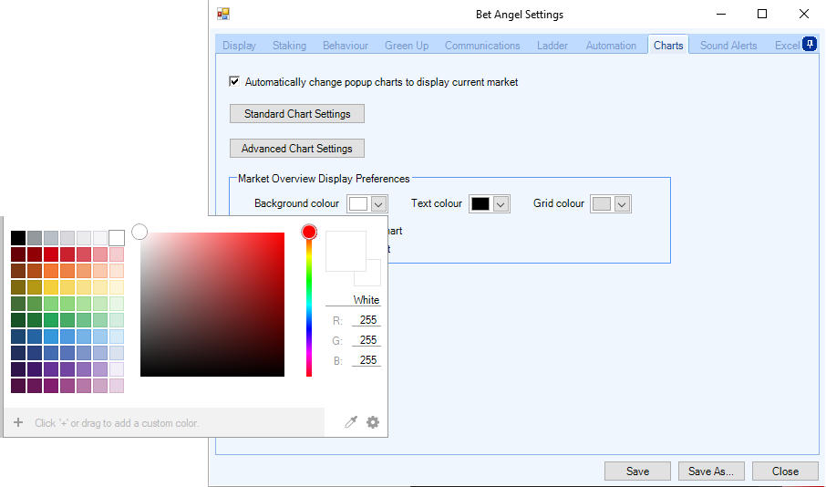
If you want to change the colours of the Market Overview screen you can do so in the settings and it’s possible to do that. Some people don’t like the white background and want a black background and you can change that in settings.
If you head over to the Bet Angel settings, then select charts. Here you can find how to modify the colour scheme used on the market overview screen.

An Overview of the Market Overview Screen
What I’m going to focus on in this video is how the information is displayed.
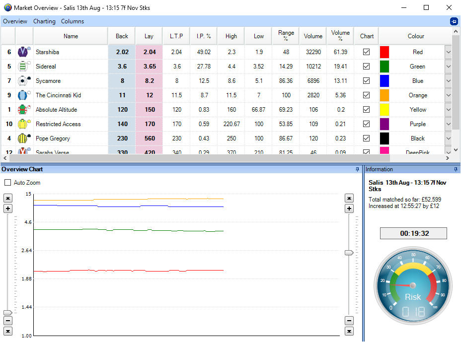
On the bottom left of the market overview screen, the market Overview chart presents you with a list of all the individual runners. This will help you spot trends a little bit quicker.
We can look closer at these by using sliders the on left or right. This will allow you to see all of the individual runners available on the screen. If you don’t use the sliders you can use the auto zoom that will basically cover all runners within that particular market.

On the bottom right-hand side here we have the Risk Meter. This is basically looking in the market and telling you how volatile that is. If it’s over in the red it’s saying the market’s very volatile, if over in the green, it’s saying it’s quite stable when you can see the yellow area here it’s saying this market is behaving pretty much as we expect. The risk meter is just giving you a view on the market and looking at how it is behaving based upon these types of markets historically, so that should prove useful.
Incidentally, you can sort or grab each these panes and move around or delete them. When you save that in settings you can have that as your standard default Market Overview screen so it is actually possible to modify all elements of the screen. If you save the settings that will allow you to have all of that set up exactly the way that you wish.
The overview contains a range of information about the market you are interested it.

Reading from left to right there is a range of information available for you to view: –
- Racecloth number
- Silks, hover over these to get more information about the jockey and form etc.
- Back price
- Lay price
- Last trading price
- Implied probability (Chance of winning)
- Current high traded price
- Current low traded price
- Where is the current price in it’s traded range
- How much money has been traded on this runner
- What volume % does this runner have of the market
- Should this appear on the overview chart?
- What colour should this runner be
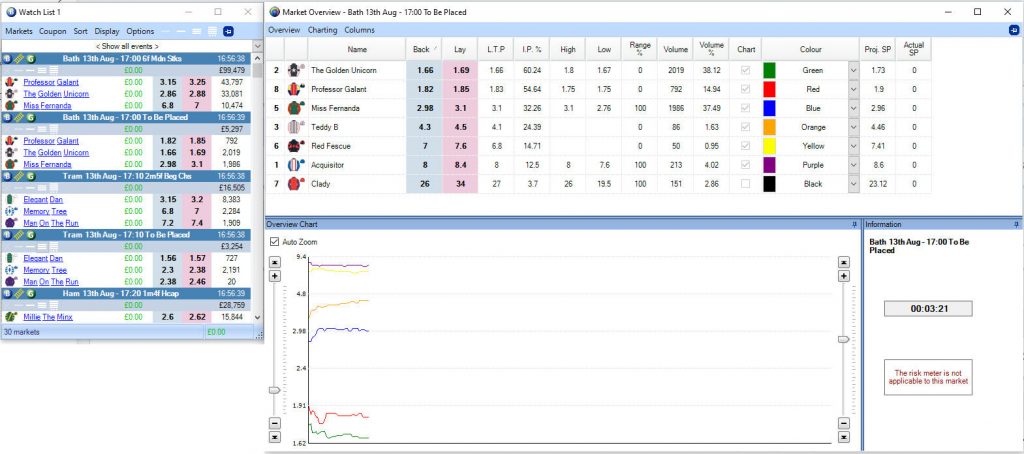
- What is the projected SP
- What is the actual SP (Only appears when the market goes inplay)
Market Overview Options
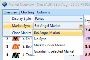
At the top left of the screen you can see we’ve got the overview options available. There are a number of different ways of modifying the Market Overview screen.
If you have the Market Overview screen up and you’re wandering around Guardian or looking at a watch list then it can automatically display the Market Overview data related to that. You can also have it displayed as panes or you can have it displayed as tabs. You can also it split up into individual tabs so you can have the grid on one tab and the chart on the other it’s up to you how you wish to display that particular information. Again, if you save this it will save within your settings as well.

- Using the column chooser you can decide what columns appear on the screen by removing columns or adding columns that prefer
- With charting, which is the overview chart that you can see at the bottom left. You can change a range of options relating to this how and what is displayed
- The ‘overview’ area can change how the overall screen actually looks and it allows you to decide how it draws information into the screen.
Using with a mouse-over Watch List.
As we have shown you can get the market overview screen to display what is on Bet Angel Guardian. But you can also do this in terms of a mouseover as well.
This means that when you’re actively moving the mouse around it will actually highlight those markets underneath your mouse in the market overview screen. This feature is really useful for something like the watch list. If we have populated a watch list, we don’t need to visit the market we want information on, it’s going to automatically appear on the market overview screen.

Summary
The Market Overview is a really useful way of getting a summary of all the activity in the market at a glance and it will present you with a few opportunities if you use it for this.
Before each session, I start up Bet Angel Guardian and the market overview screen and start flicking through the markets to see what is infront of me on the day. It’s a good way of not only getting an overview on what is ahead of you for the day, but also for spotting opportunties.
This is made particulary easy with all the customisable and display options available on the market overview screen. It was one of the first extended features, we put into Bet Angel, but it’s evolved a fair bit in the interveneing years. So it’s worth checking out!
The post The Bet Angel Market Overview Screen appeared first on Betfair trading blog | Expert advice from Professional Betfair trade.
